
← Back to Who decides how my app looks?
How do I switch between light and dark, or change colours?
Short answer
Press the theme button in the top bar until it shows Dark or Light; for your own colours, press ✎ and choose them.
Before you start
You need to be signed in to GilbApp on a computer. The pictures show a made-up person on a test site; your screen shows your own name and address.
Words used here (1)
- GilbApp
- GilbApp is the app, opened in a web browser at https://gilb.com/app, where you open, fill and share your vaults.
Steps
Press the theme button until it shows the theme you want.
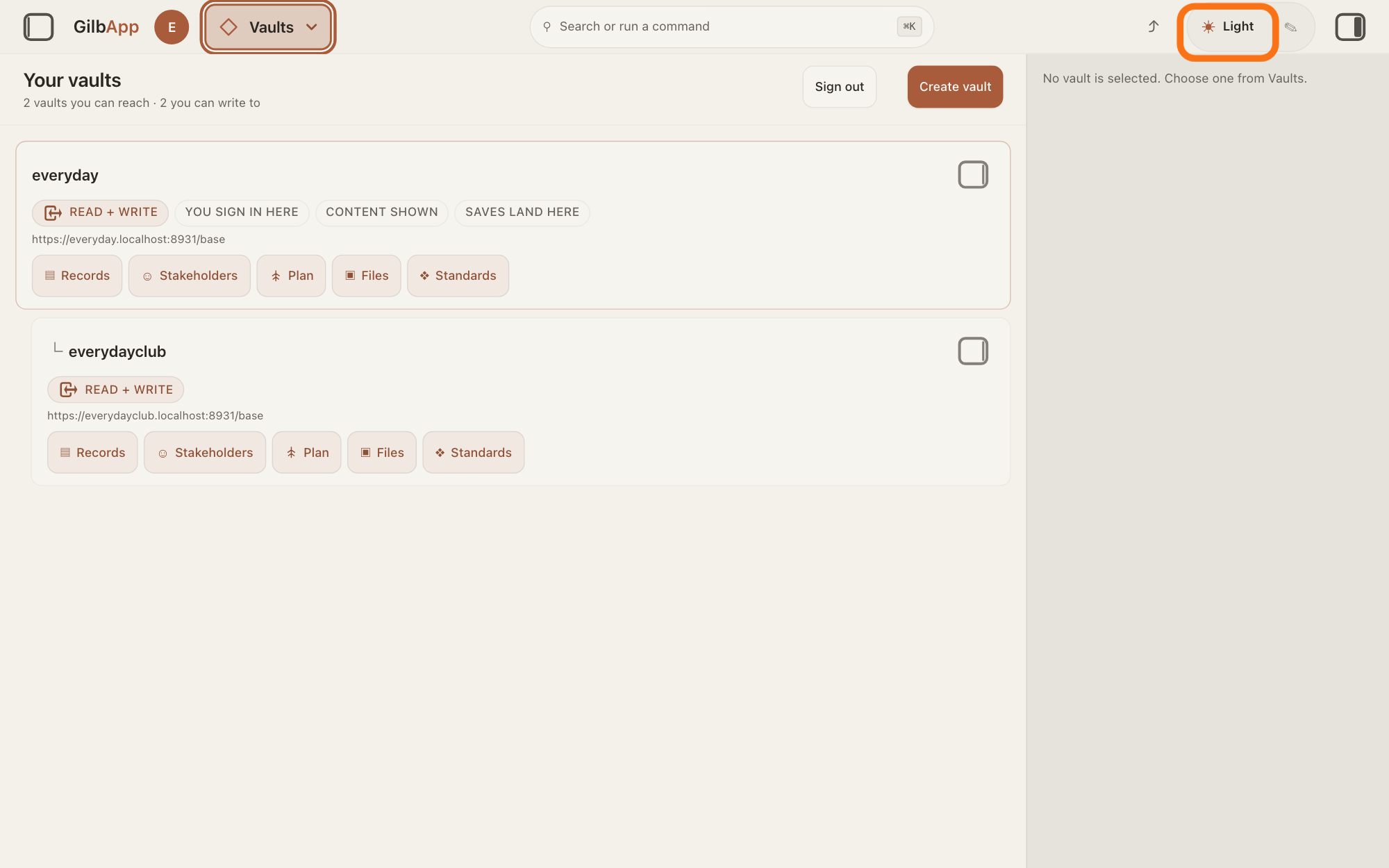
Press the theme button at the right of the top bar; it shows the theme you have now, the set of colours GilbApp is drawn in, such as ☀ Light. Each press shows the next one, ☾ Dark, ◉ Colourblind, ◐ Custom, then ☀ Light again, and the whole screen changes at once.
Show as text
The screen shows "Your vaults" in the Light theme. At the right of the top bar, right of the arrow "⤴", the outlined theme button reads "☀ Light". Click it to go to the next theme; click again until it shows the theme you want.
More about this
Its hover text is Cycle theme (Light ▸ Dark ▸ Colourblind ▸ Custom). Light shows until you choose another. Colourblind uses colours that people with colour blindness can still tell apart. Custom shows your own colours from step 3; until you have set any, it looks like the theme before it. GilbApp keeps your choice when you come back in this browser. ⤴, left of the theme button, shares a link to what you are looking at; you do not need it. You can also choose Theme — Light, Theme — Dark or Theme — Colourblind under THEME in Search or run a command, with ● before the one you have.
Press ✎ beside the theme button.
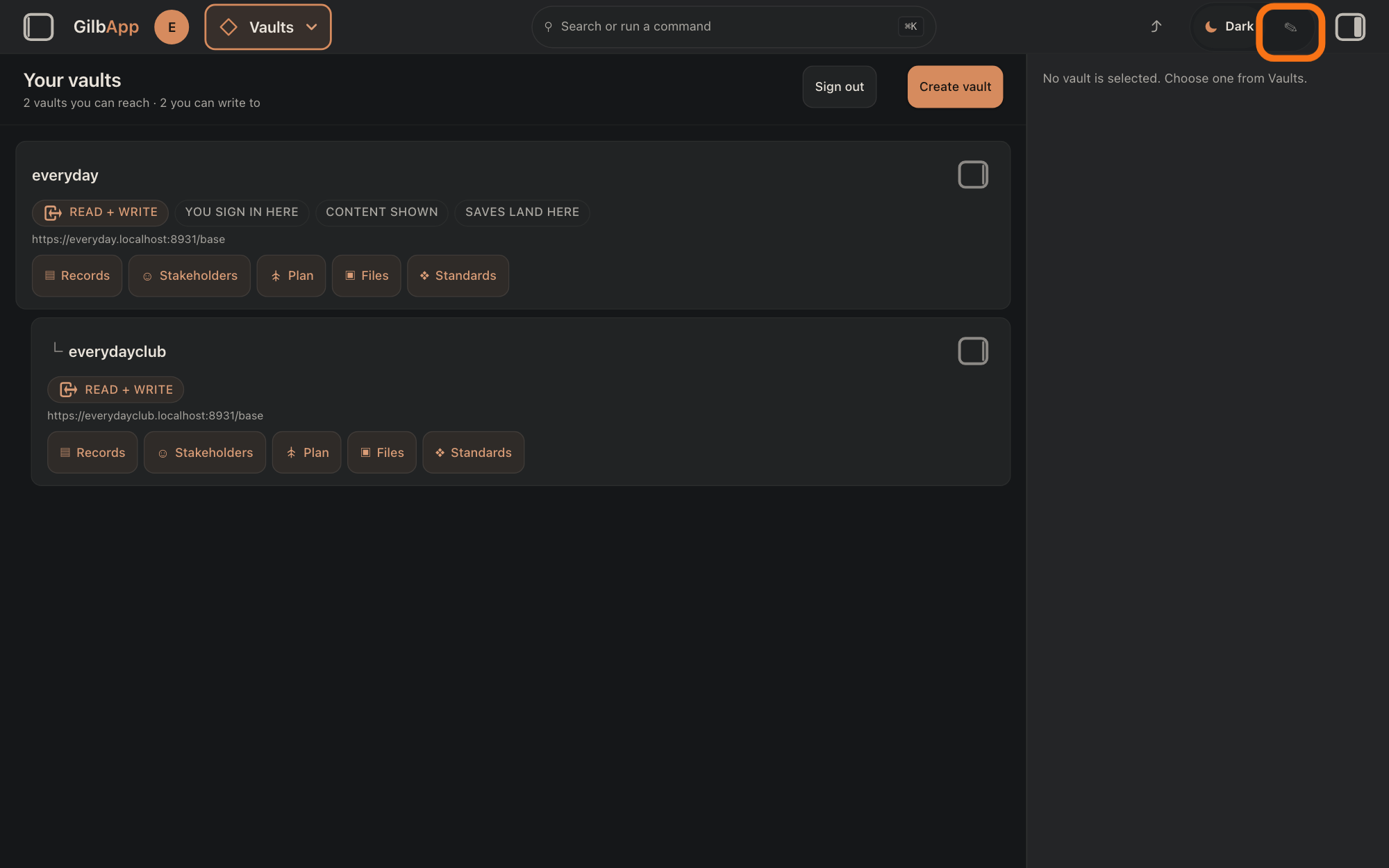
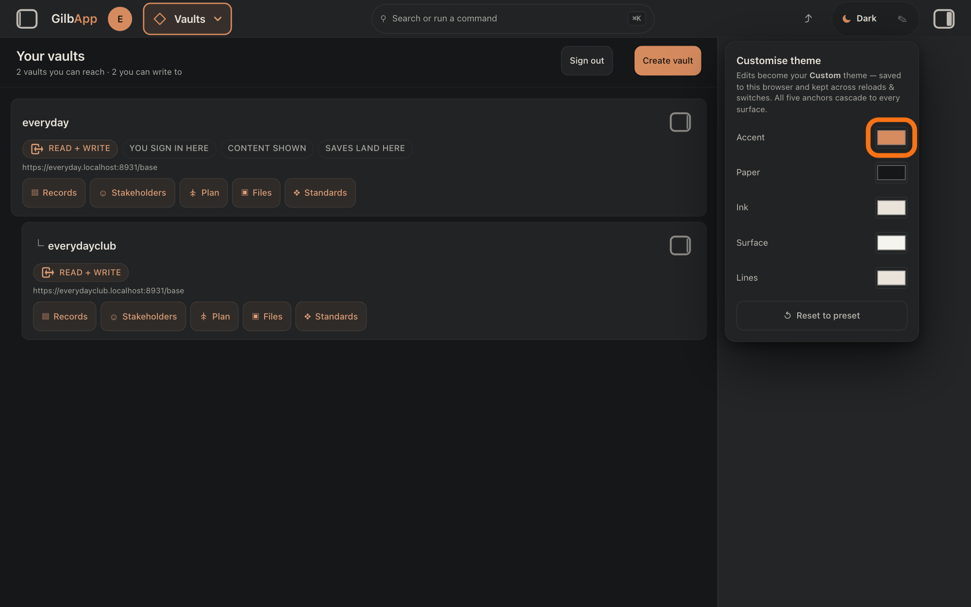
Press ✎ at the right end of the theme button; its hover text is Customise theme. A panel headed Customise theme opens under it, with five colours: Accent, Paper, Ink, Surface and Lines.
Show as text
The whole screen is now dark and the theme button reads "☾ Dark". At its right end is the small pencil "✎", outlined. Click "✎" to change the colours.
More about this
The pictures show ☾ Dark, one press on from ☀ Light. The panel says "Edits become your Custom theme — saved to this browser and kept across reloads & switches. All five anchors cascade to every surface.": the anchors are the five colours, and the other colours on the screen are mixed from them. Accent colours highlights, such as App in the name GilbApp at the top left; Paper is the background; Ink is the text; Surface is panels and cards, a little lighter than Paper until you change it; Lines is the thin borders, made from Ink until you change it.
Choose a new colour beside one of the five names.
Press the colour box beside a name, and choose a colour in the colour picker your browser opens. The screen takes the new colour at once, and the theme button shows ◐ Custom.
Show as text
A panel headed "Customise theme" is open at the right, with five rows: "Accent", "Paper", "Ink", "Surface", "Lines", each with a colour box, and "↺ Reset to preset" at the bottom. The outlined colour box is the one beside "Accent". Click a box and pick a colour.
More about this
Your colours are laid over the theme you were in, such as Dark; the colours you leave alone stay as that theme has them. Change as many of the five as you like. The colour picker is your browser's own, so it looks different in each browser. To close the panel, press ✎ again, press Esc, or click outside it; your colours stay. When the theme button moves on to ☀ Light and the others, GilbApp keeps your colours for the next time it shows ◐ Custom.
To go back, press ↺ Reset to preset.
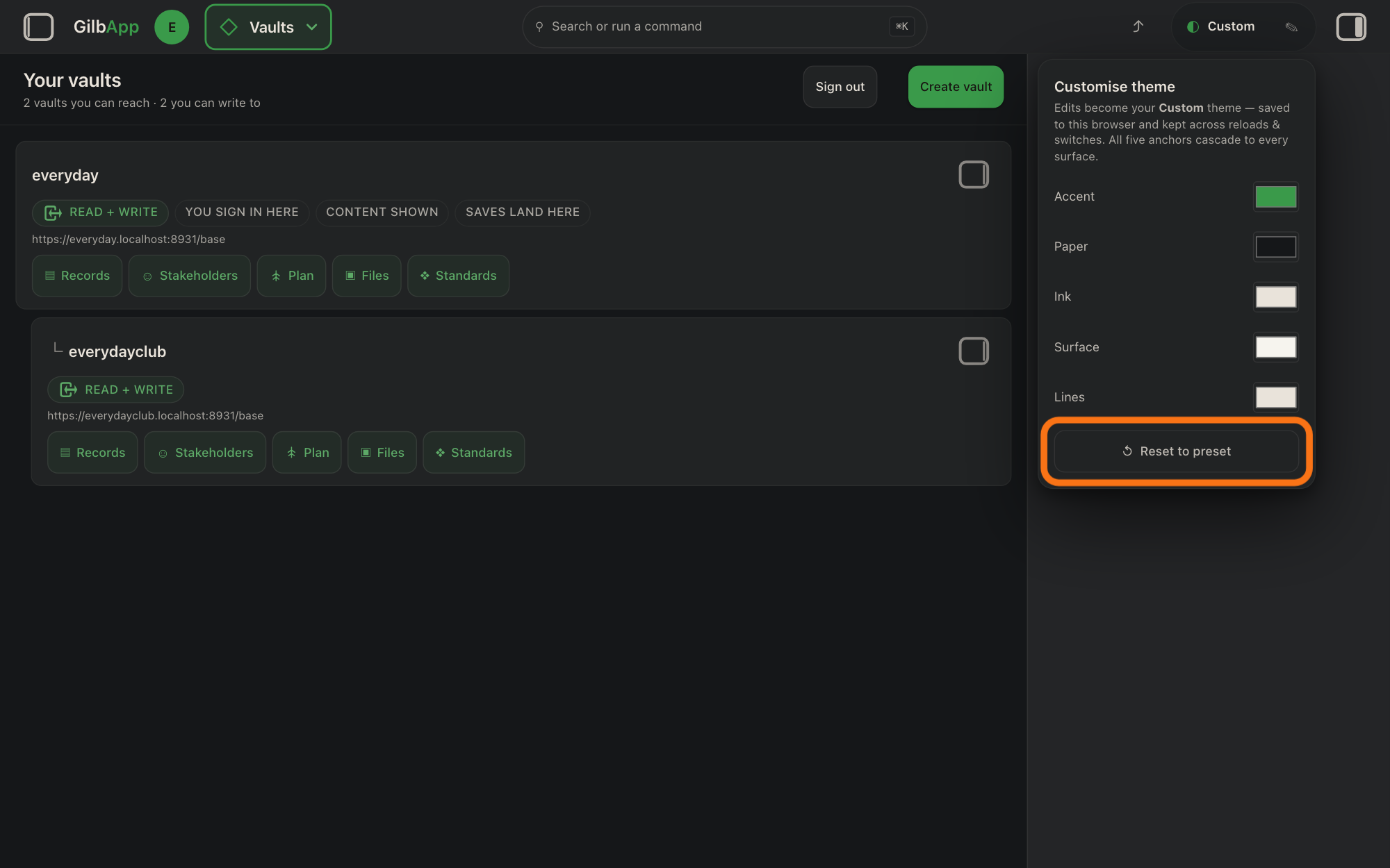
Press ↺ Reset to preset at the bottom of the Customise theme panel. GilbApp drops your own colours and goes back to the theme they were laid over, such as ☾ Dark.
Show as text
The accent colour is now green, and the theme button at the top reads "◐ Custom". At the bottom of the "Customise theme" panel, the outlined button reads "↺ Reset to preset". Click it to go back to the theme's own colours.
More about this
A preset is one of the ready-made themes, Light, Dark or Colourblind. It asks nothing first. Your own colours are then gone; to have them again, choose them again as in step 3.
Deeper
Also asked:
Can I make the text bigger? GilbApp has no text size of its own: use your browser's zoom, ⌘ and + on a Mac or Ctrl and + on Windows, to make all of it bigger. In Plan, the table has its own Size: Small, Normal, Large or Fit width.
Your theme and colours change only how GilbApp looks to you; they do not change how anyone else sees GilbApp.
In a window narrower than 640 pixels, such as a phone, the theme button is not shown: press Search in the bar at the bottom and choose a line under THEME; Customise theme… there opens the same five colours, with ✕ to close them.
This answer is written for a computer screen.
Source: GilbApp af0f04ee838a4d55887d2ff1f72edd49a4ff7ca0 (https://gilb.com/app/version.json read 2026-11-10, buildTime 2026-11-09.522Z, dirty false); code read (no checkout, no copy). Theme button: src/components/ThemeSwitch.tsx:13-50 (one button showing glyph + label, title Cycle theme (Light ▸ Dark ▸ Colourblind ▸ Custom) :25, ✎ with title Customise theme :35-45); src/hooks/useTheme.ts:40-47 (CYCLE_ORDER light, dark, cvd, custom; THEME_META ☀ Light, ☾ Dark, ◉ Colourblind, ◐ Custom), :312 (default light), :607-616 (cycle; Custom with none saved = the preset before it, base = that preset), :593-605 and :615 (a preset keeps the dormant custom), :618-630 (setAnchor: Custom over the current preset, only the edited anchor), :632-638 (resetCustom: drops the overrides, back to the base preset; no confirm), :148-168 and :572-591 (local cache + write to the personal vault). Placement: src/components/AppShell.tsx:2000-2002 (after ShareButton ⤴ :1998, `hidden sm:block` around ThemeSwitch), :2005-2030 (selected vault right of it), :1950-1956 (wordmark Gilb<b accent>App</b>), :2116 (bottom bar Search opens the palette), :2160-2166 (palette Customise theme… opens the sheet). Editor: src/components/ThemeEditor.tsx:45-53 (intro line, verbatim), :56-70 (five labelled colour inputs, type=color), :72-78 (↺ Reset to preset), :94 (transparent click-outside backdrop closes), :33-40 (Esc closes), :100 (heading Customise theme), :144-153 (sheet ✕). Anchor names: useTheme.ts:32-38; meaning: src/styles/tokens.css:17-22 (accent, paper base background, ink text), :39-40 (surface lifted paper, lines = ink), :48-49 (borders drawn from lines at 9% and 5%), :103-113 (cvd = Okabe-Ito hues, colour-blind-safe). Palette: src/components/CommandPalette.tsx:13-19, :199-213 (Theme — Light/Dark/Colourblind, ● for the current one, Customise theme…), :297 (group heading Theme). Per-person, not per-vault: AppShell.tsx:546-563 (preferences only in the signed-in person's own vault). GilbVeda (public read 2026-11-10): t:AppUiPreferences, a:themeMode, a:themePalette (all Suggested).
Checked against GilbApp d529620.